I’m working on a plugin called Disengaged which removes the parts of websites that draw you in far longer than you anticipated. One of the things it does is prune comment threads. The goal is to make reading the comments take less time than you spent enjoying the original content. It’s weird that that’s not how the internet works right now, but I digress.
While reading Hacker News I saw a good example of the plugin in action, good enough to share. It all starts with a show-and-tell post from a user who built a Kanban workflow for email. The landing page for the product looks like this.

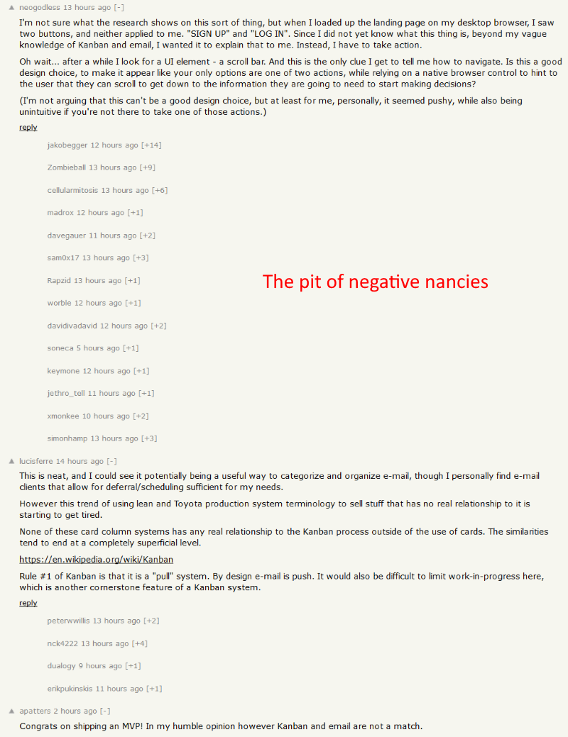
If you head to the HN comment thread the top comment as of writing is someone poo-pooing the landing page because it looks like you only have two options, when really you can scroll down for more information. That reply is followed by 50+ sub-replies also critiquing the landing page for, need I remind you, someone’s show-and-tell project.
It’s really up to the site designers to curate comment threads responsibly, but my plugin will fill in when they slack off. An effective and generalized technique I’ve found is to simply lop off comments based on their depth. Direct replies are almost always written on-topic but threads quickly derail as soon as someone is replying to a reply. If you prune the comment thread for KanbanMail something amazing happens.

There’s pages of positivity and well-wishes written for the developer! …Well, it’s positivity accompanied by harsh critique of the product, but that’s what passes for high praise in the incredibly toxic Hacker News community. If you view this comment thread in its natural state you’re treated to about 10 pages of bikeshedding landing pages. With Disengaged pruning it you get a glimmer of humanity’s good side. (And an MBA you didn’t ask for.)
This is exactly the sort of moment I built Disengaged for. Without it you may find yourself sucked into an internet upvote battle about marketing dark patterns. With it you get a high level picture of people’s reactions and can move on with your day.
There’s a lot more stuff the plugin does so if you’re a fellow developer or web designer who believes the web could do with a little taken off the top, check out Disengaged on GitHub for more info about the community including how to contribute.